Trane Technologies Showcase
The showcase is the Standard Work for site owners and editors who manage the Trane Technologies Enterprise public websites utilizing our Enterprise Content Management System - Adobe Experience Manager (AEM). It provides users with interactive and visual examples, specifications and best practices for using the various features of the website as well as Authoring and Documentation Reference Guides.
The showcase will highlight all components and page types developed for Trane Technologies. Additionally, it will show the style and content options available for each component which are available for use on any page, unless specifically noted otherwise. It also features specialized components which only belong to our Blog.
Components
Heading Components

Featured News Story
Available only on the News Landing Page, the Featured News Story Component highlights one News Announcement.

Heading
The Heading Component displays an image along with the page title and optional tagline over top of it.

Hero Carousel
The Hero Carousel Component displays a heading, image, description, and CTA in a rotating carousel.

Section Heading
The Section Heading Component allows a heading to be placed anywhere on a page to define different sections of the page.
Media Components

Adaptive Image
The Adaptive Image Component displays an image with an optional title and description.

Ambient Hero
The Ambient Hero displays a short ambient video or a static image.

Impact Hero
The Impact Hero displays an Act/Impact message along with an ambient video or a static image.

Inset Image
The Inset Image displays a large image with multiple smaller inset images on top of it.

Video
The Video Component displays a video that plays in a modal.
General and Utility Components

Accordion
The Accordion Component displays content that the user can interact with by expanding and/or collapsing the information.

Blockquote
The Blockquote Component allows an image and/or text to be styled as a blockquote or pull quote.

Button
Buttons display text as a linkable CTA.

Column Control
The Column Control Component displays other components next to each other in responsive columns.

Disclaimer
The Disclaimer Component displays text styled slightly smaller than other text.

Freeform HTML
The Freeform HTML component is used only with explicit permission and allows for approved custom HTML code to be used on a page.

Form
The Form Component displays a form with configurable form fields.

Narrow Container
The Narrow Container restricts the width of components placed in it.

Section Subnav
The Section Subnav Component allows additional navigation links for a specific section of the site.

Text and Image
The Text and Image Component displays rich text and an image with alignment options.

Thread Banner
Authorable only on the homepage, but viewable on all pages of the site, the Thread Banner Component displays text and a link as a banner across the top of the site.
Promo and Callout Components
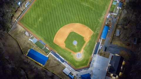
Act Impact Component
The Act Impact Component displays an Act/Impact message along with an Act and/or Impact image.

Announcements
The Announcements Component allows multiple announcements to be displayed on a page.

Awards/Industry Promo
The Awards/Industry Promo Component allows multiple Awards to be highlighted on a page with a linkable CTA.

Card Component
The Card Component displays cards of varying content with a large background image.

Content Promo
The Content Promo Component displays a stacked image with text and an optional link.

Featured Links
The Featured Links Component displays a list of links with an optional small image.

Logo Content Promo
The Logo Content Promo Component displays text and logos horizontally centered.

News Release
The News Release Component displays press/news releases from an external feed.

Photo Promo
The Photo Promo Component displays links with text and an image.

Promo Carousel
The Promo Carousel Component displays Small Photo Promos in a rotating carousel.

Social Feed
The Social Feed Component displays a link to a social media channel with an optional icon and social feed embed.

Social Follow Promo
The Social Follow Promo Component displays icon links to social media channels.

Three Column Promo
The Three Column Promo Component displays three images, text, and a CTA.

Two Column Basic Promo
The Two Column Basic Promo Component displays text content and an image side by side. The text content options include multiple headings, descriptions, CTAs, and stats.

Two Column Brand Promo
The Two Column Brand Promo Component displays text content and an image side by side. The text content options include a brand logo, a heading, a description, and multiple links.
Page Types
Examples of each page template

Homepage
Example of the current homepage.

Landing page
Example of a Landing page that can contain any pattern of components.

Event Page
Example of an Event Page with session and speaker details

General Content Page
Example of a General Content Page with a right rail.
Blog
While the Blog site can utilize the main site components, it has a few unique components that are only applicable to this site.
Heading Components

Blog Hero
The Blog Hero displays a heading in an <h1> and an optional description.

Category Heading
The Blog Category Heading displays a heading in an <h1> and an optional description. It also includes a colorful line below it indicating the specific category.
Generic, Utility and Promo Components

Featured Article
The Featured Article Component displays content about a blog article and links to that article.

Feature Cards
The Featured Cards Component displays cards with info about and links to blog articles.

Blog Text
Available only on the Blog article pages, the Blog Text Component displays rich text with two options to highlight additional content: a Two Column Text and the Pull Quote with optional attribution.

Blog Grid
Available only on Blog Category pages, the Blog Grid Component displays cards with info about and links to blog articles with a load more button.

Blockquote
The Blockquote Component allows an image and/or text to be styled as a blockquote or pull quote.

Section Overlap
Available only on the Blog homepage, the Section Overlap Component displays links to blog articles with the first link displayed with the blog info overlaping the blog image.

Popular Topics
Available only on the Blog homepage, the Popular Topics Component displays cards with info about and links to blog articles tagged as "popular".

Recommended
Available at the bottom of Blog article pages, the Recommended component displays a list of cards with info and links to other blog pages in the same category.

Related Links
Available on the left rail of Blog article pages, the Related Links component displays a list of links to other blog pages in the same category.
Blog Page Types

Blog Article
Blog Articles make up the majority of the Blog site. Typically we publish 2-3 articles per month.

Blog Author
Each of our authors have a bio page to highlight their thought leadership for Trane Technologies.
Authoring and Documentation Reference Guides

Web Style Guide
Learn about our styles for web and digital applications to ensure anything developed is within required specs.

Dynamic Media Use and Image Component Reference Guide
Learn about each of the components that utilize images and how we manage them.

Blog Article Publishing Process
Authors can utilize this reference guide when building a new blog article.

Adobe 6.5 Documentation
Our Enterprise site is currently on AEM version 6.5 as of July 2021.


